


Hidden Mysteries of Prints
Canvas Size vs Print Size
Ratio Canvas
Size
This is a list of canvas print sizes offered by White House Custom Color which is my recommendation for a print house. I have no relationship with them, other than as a customer. They produce magnificent, color-critical prints. My advice is to  pick your print company and take a list like this with you to the canvas store. Buy only canvases that are on the size list of your selected print company.
If you bring in an original for capture that is not offered as printable by your print company, I will need to crop the long side to the nearest printable size.  That may be a fairly small crop or not, depending on the difference in your canvas size and the nearest printable size.
You also may want to crop unevenly, one side more than the other. This will incur an additional editing charge. My advice is to take your list to the canvas store.
Uh, Oh! Here comes Aspect Ratio...
Now let's talk about aspect ratio because it bears directly on the size issue. Sounds like math, huh? Well don't freak out. Simply, aspect ratio is the relationship of the canvas width with the canvas height. A 20"x30" canvas has an aspect ration of 2x3. That's a simple one. I have built an Excel spreadsheet with much more detail here.
The reason this is important is because aspect ration can be an enormous help in your canvas choices. Let's say you're in the canvas store and you see a sale on a particular size canvas.  It's an odd size not included in your print-size list. You think, "No wonder it's on sale!" Then you see a canvas that suits your latest artistic idea. You like how wide it is compared to how tall. Yep, this will do nicely and it's on my print-size list!
Let's say your chosen canvas measures 16"x20" which is a 4x5 aspect ratio. You look at your list and find two other sizes, 8"x10" and 24"x30" which share the same 4x5 aspect ration. Nice variety in sizes but the same pleasing aspect ratio. Then you see another canvas that's a bit different at 16"x24" with a 2x3 aspect ratio. You really like that aspect ratio also, so you look for other sizes and find a 20"x30" and a 24"x36" and they all share the 2x3 aspect ration.
By following some version of this technique, you will arrive back at your studio 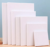 with an inventory of canvases and absolutely certainty that each one is a printable size. No cropping needed to make a print. Just art, at it's purest.
Camera/Art Alignment
This is a technical issue that is my responsibility, but it will of benefit to know, if you attempt to photograph your own art.
To create a perfect print, the camera lens must be absolutely centered on the art. Not only must the vertical and horizontal position be as near perfect as possible, but once there, the three axes possible in 3D space must also be as near perfect as possible.
Think of an airplane flying through the air. The nose of the airplane can point up or down depending on the pilot's desire to climb or descend. This is called "pitch." The nose can also point to the left or right, called "yaw." The third axis is controlled by dipping one wing or the other, called "roll." If the pitch, yaw, or roll of the camera, in relation to the canvas, is not also centered on the canvas, there will be distortion.
If the yaw is off, that is, if the camera is centered horizontally and vertically, but the lens is pointed slightly to the left, the canvas will appear slightly taller on the left side. This causes trapezoidal-style distortion, and we certainly don't want that! It is the same with the other axes, as well. The alignment of the camera lens to the canvas is critical for successful print making.
We center a grid panel on the easel, both horizontally and vertically. Then the center of the camera lens is aligned with the center of the grip panel, vertically, horizontally, and in all three 3D axes. Then we replace the grid with your canvas, and center it on the easel. That positioning alleviates any mis-alignment distortion.
Back-lit Screens vs Wall-Hung Art
The difference between art displayed on a back-lit monitor, and art hung on the wall, is about light.
This was a hard-learned lesson. We live in a world of light and as artists, albeit in different media, light is the primary component of our world. And yet our understanding may be lacking in this important area. When your art is successfully captured by the camera and then displayed on a monitor, light emanates from the monitor and bombards your eyes with unnatural intensity. Colors appear brilliant and saturated and we're dazzled by their strength.
"Oh, this is going to be a great print," we exclaim. So we have a print made and hang it on the wall and stand back and review. Okay, the colors are correct. All the basics are there. It just doesn't look quite like it did on the monitor. What gives? The answer comes back to light.
While the light bombarding you from the monitor is brilliant and amazing, the light from the print is, wait for it... REFLECTED! The print on the wall is reflecting the ambient light in the room. Even a light directly on the canvas is reflected. Oops. What can we do? We want our prints to be as brilliant as we saw on the screen.
The step that makes it all work is done in Photoshop. What? Are you going to make a cartoon out of my art? Nope. No worries! What we do in Photoshop simply enhances the reflective capabilities of the print. When placed side-by-side, we want the print to be as indistinguishable from the original as possible.
Right from the start, this was a problem, seemingly without an answer. It involved the physics of light and we thought, "You can't fight that, or gravity." We were wrong on the first point. As I was playing around with one of my daughter's originals, I applied several Photoshop adjustments and all of a sudden the comment was made, "Oh, that POPs!" And a phrase was born.
By making these slight Photoshop adjustments, we found the answer. We needed to slightly enhance the image in just the right ways and now we know when we've reached that goal with each print when we look and exclaim, "Oh, that POPs!" Far from cartoonish, the onscreen image looks slightly more brilliant but the resulting print is virtually indistinguishable from the original. Obviously, we can't reproduce the kind of physical depth possible with oils or acrylics, but from a lighting perspective, we found success! We finally figured out how to make Prints That Pop!
We'll discuss this technique more in the How We Do It section. Your role, as the artist, is one of participation in this process. We don't do anything without your approval. Hold that thought.
Reviewing the Print Image
An interesting situation arises when an artist takes the print images we're created and displays them on a non-color-critical monitor. All of a sudden the colors are wrong and the Pop is gone. Your screen at home or your office is probably not color-critical or, at least, calibrated. This just means that your monitor is not correctly representing the colors of the image. There is nothing, inherently, wrong with either the image or the monitor.
Trust what you saw on my screen which is a high-end color-critical monitor made to photographic tolerances. In addition, I use a monitor calibration device to regularly "calibrate" two of my monitors. Since my third, "admin" monitor, is neither color-critical or high-end, I will demonstrate the issue during our session. If you desire to view your print images with correct color representation, a mid-range color-critical monitor is a good artistic investment and not prohibitively expensive. I don't sell them, but I can point you in the right direction.
Shiny Stuff
We want to capture your art before you varnish. Galkyd is fine, with some moderation, but any final glossy work on your art should be accomplished after we capture it. This is not, necessarily, a hard-and-fast rule but we should chat about this if you have questions. Just be aware that the more reflective your art, the more difficult is the lighting situation, and extra costs may apply.
Get Proofs
As you gain experience with your print company, and become more adept at print-making, you'll gain confidence that your prints will Pop! In the beginning, however, and anytime you're making a large or expensive print, getting proofs is wise.
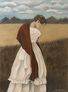
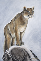
Note: Many thanks to the artists whose works we've been privilaged to photograph over the years, some of whose works are displayed on this site as thumbnails. These artists are: Celestial Williams, Jodee Huish, Ruth Farris, Casy Wakefield, Donna Morris, and Mary Kabanuk. Copyrights to these thumbnails belong to the respective artists.